So I wandered through photos and Design Seeds and I'm still really not any closer to a decision.
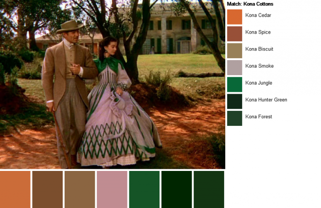
Am I Scarlett and any one of her numerous green dresses?
{Photo via How Do We Run On}
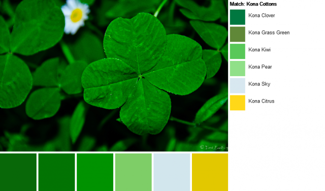
A lucky four leaf clover with a hint of daisy?
{Photo via Black Chick on Tour}
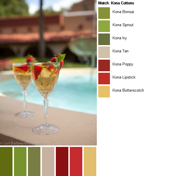
Ooh, sangria! I could be sangria!
{photo via Lori Barbely Photography}
I think part of this indecision stems from not having a quilting style. I mean, I finished Cat Tails and Central Park Sudoku this year...those two couldn't be more different! But they're both in my living room. {Maybe that's part of the problem.}
I know I like blogs with calm, white backgrounds, and not a lot of stuff cluttering up the design. Which leads me to thinking about sponsorship and linky parties and what exactly will be on the new blog.
And then I get a headache and put off the switchover.
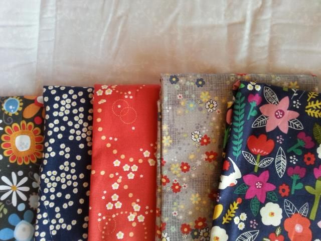
And go pull fabric for a quilt because those colors, I can do.
haha. Decisions decisions. I guess when you find what's right for you, you'll be motivated to do it. Though you certainly could test one out for a week or so and see how it feels 'on'....Hard to know till you really see it on your blog...
ReplyDeletewell .. just to make your decision maybe a bit easier - I like the colour palette of th clover and daisy best ... those are the most "fresh" that is undiluted (not muted, not pastelly) look ... there is white in it, so a white for the postbackground is possible with black text, dark green for links, on of the lighter greens for "frames" and the really light green maybe as background for the tabs and such and the blue-ish white for the page background ... And the Yellow maybe for headings ...
ReplyDeleteJust some ideas - now you can argue for against those proposals and defnd your own decisions - I always find it makes it easier to make up onces mind if you can at least exclude some things ...
I don't mind if you think what I wrote absolutely horrifying ... well at least then you know that is absolutely not what you are going to do.
I do prefer bright and snappy to muted and understated. And any Scarlett palette is a good one in my book.
ReplyDeleteThanks for always playing along.
I too like the bright and the snappy, so the 4 leaf clover palette would get my vote.
ReplyDelete